
Mastering the Art of Clarity: Visual Hierarchy & Design for Readability
- Apr 22, 2024
- 2 min read
Ever visited a website so cluttered it felt like a digital rummage sale? Or struggled to decipher a presentation slide packed with information overload? Clear communication is paramount in design, and visual hierarchy is your secret weapon to achieving it.
This article is merely a snippet from our FREE Visual Hierarchy Master Guide (Download now)
What is Visual Hierarchy?
Imagine a bustling marketplace. Stalls overflow with goods, signs compete for attention, and navigating the chaos feels impossible. Now, picture a well-organized store. Products are categorized, aisles are clear, and key information is readily available. Visual hierarchy is the difference between those two scenarios. It's the art of arranging design elements to guide the user's eye and prioritize information.
Why Does it Matter?
Enhanced User Experience: Users shouldn't have to work to understand your design. Visual hierarchy ensures a smooth, intuitive experience, directing attention to the most important elements first.
Improved Readability: Clear hierarchy reduces visual clutter and makes text easier to read, leading to better user comprehension and engagement.
Stronger Communication: By strategically highlighting key information, you can effectively communicate your message and ensure users take the desired action.
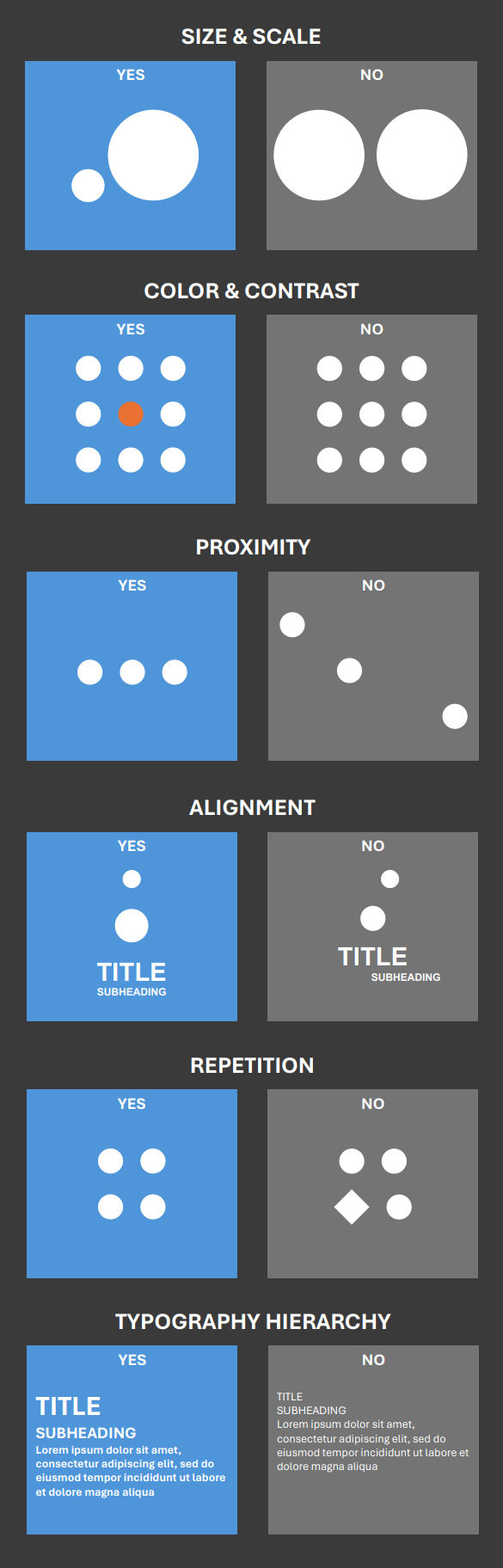
Creating Visual Hierarchy in Action:
Size Matters: Larger elements naturally grab attention. Use larger fonts for headlines, and reserve smaller sizes for body text.
The Power of Contrast: Make important elements stand out with contrasting colors, brightness, or texture. Imagine a bright call-to-action button amidst neutral text – it's hard to miss!
Proximity is Key: Group related elements close together to create visual unity. Think of a website with neatly arranged product categories instead of scattered items.
Alignment is Your Anchor: Misaligned elements create disorientation. Align text, buttons, and images for a clean and organized look.
Embrace White Space: Don't fear empty space! It allows elements to breathe and prevents visual overload. Think of whitespace as clear pathways in your digital marketplace.
Beyond the Basics:
Visual Weight: Consider the inherent weight of elements. Images carry more weight than text. Use this to subtly guide the user's eye.
Negative Space Gets Strategic: Leaving more space around key elements draws attention to them. Imagine a presentation slide with a single image surrounded by ample space.
Typography Takes Center Stage: Different fonts evoke different emotions. Bold fonts grab attention, while clean fonts are easier to read for body text. Choose fonts strategically.
Mastering visual hierarchy is a journey, not a destination. Experiment, analyze successful examples, and use the tools discussed to create clear, user-friendly designs that communicate effectively. After all, good design shouldn't make your audience squint!
Ready to learn more? Download our free, in-depth guide on Visual Hierarchy & Design for Readability for a deeper dive into this essential design principle!


Comments